


Thursday Five: strangest and silliest paint-schemes in motorsport
This week marked the debut of Ken Block’s new rally cross Ford Focus RS RX, a bizarre collision of ’80s art design and contemporary motorsport technology.
It's a bizarre nod to about 18 different trends from the ’80s, somehow put together at such an angle that it works, mainly in the context of Block's demographic of teeny boppers with short levels of taste and even shorter attention spans.
Motorsport has spent a lot of its time living on the forefront of sport marketing. It was one of the first sports to adopt sponsorship as we know it today, helping foster the boom of cigarette advertising in sport in the ’70s. This eventually led to race car paint schemes blossoming from simple racing stripes to complex pieces of rolling design wizardry, something many other sports took their time to cotton on to.
Today's Thursday Five is a tribute to the weird, the whacky, the designers who laugh in the face of 'what looks corporate', and continue to help reinvent the artform as a result. We love you for it.
Andy Warhol BMW M1
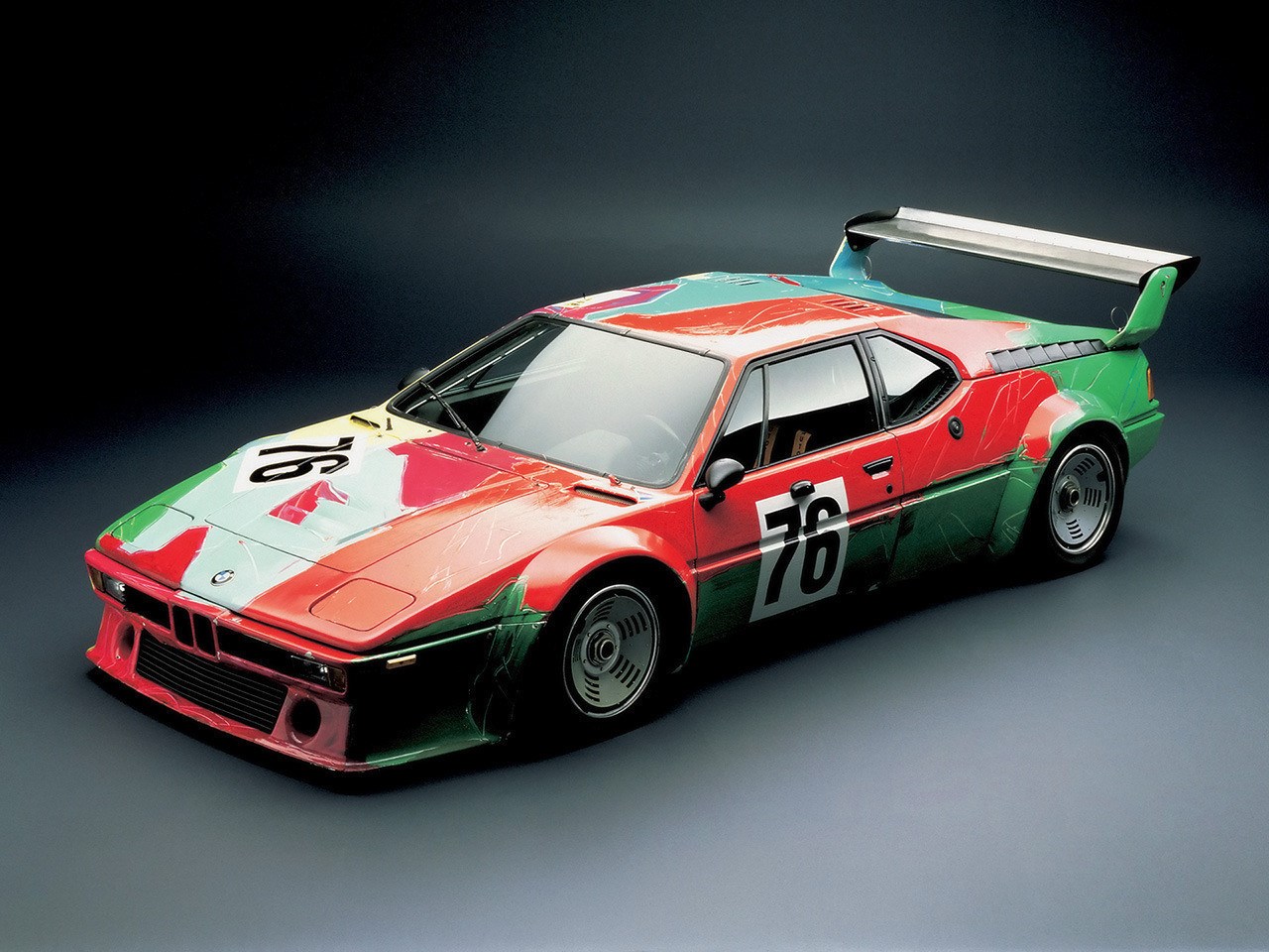
Photo / BMW
Some racing liveries are art on wheels. This M1 though, quite literally, is a piece of art on wheels.
Hand-painted by Andy Warhol over just 20 minutes, the M1 went on to claim a stunning sixth-place finish at the1979 24 Hours of Le Mans. But the livery will always be its true calling card.
Warhol threw this livery together by hand in a whirlwind 20 minutes, adding various louvres in the paint to the splashes of organized chaos. Some will label it wasteful or silly, but many more harbor a soft spot for it — myself included.
It wasn’t the first of BMW’s infamous Art Cars, but it is definitely one of the most memorable.
Audi R8 ‘Crocodile’
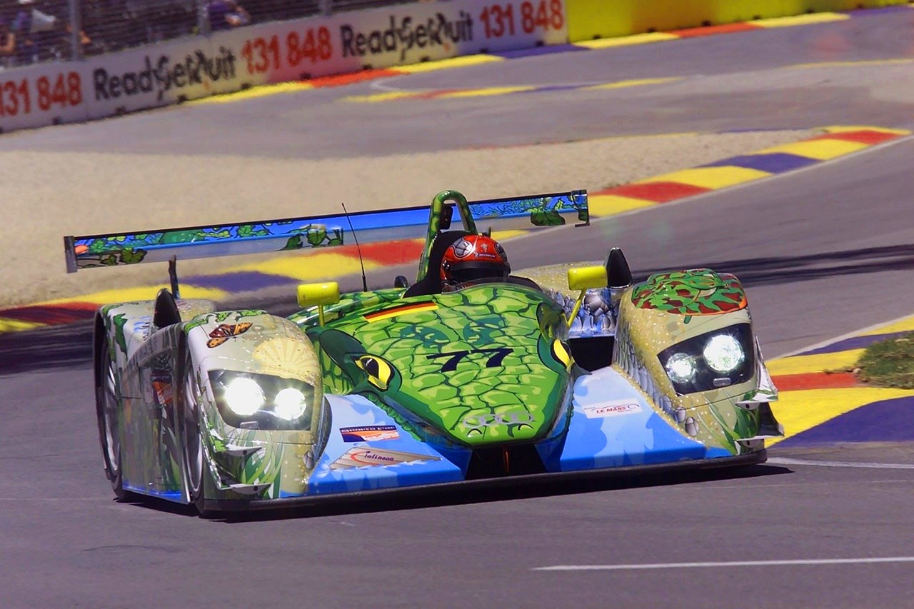
Photo / sourced
As weird as it is wonderful, the ‘Croc’ is one of my all-time favourite racing liveries.
Raced by Allan McNish, Rinaldo Capello, and V8 Supercars team owner Brad Jones in the first and last ever Race of 1000 Years event on Adelaide’s illustrious street circuit, the Audi won — gifting McNish the 2000 American Le Mans Series championship.
But like the Warhol M1, nobody remembers this car for its win. They remember it for how it looks.
It’s such a simple idea, executed to an incredible degree. Modelled on a crocodile swimming (Sauntering? Meandering?) down a river, the Croc R8 is packed with all sorts of wonderful details. The grassy reeds on its flanks, the adorable air intakes that are painted up as fish, the textures in the sand, the whole thing is incredible.
I liked it so much that I recently bought a 1:18-scale model of one from Greece. From Greece!
Greg Murphy’s first Pepsi Max Commodore
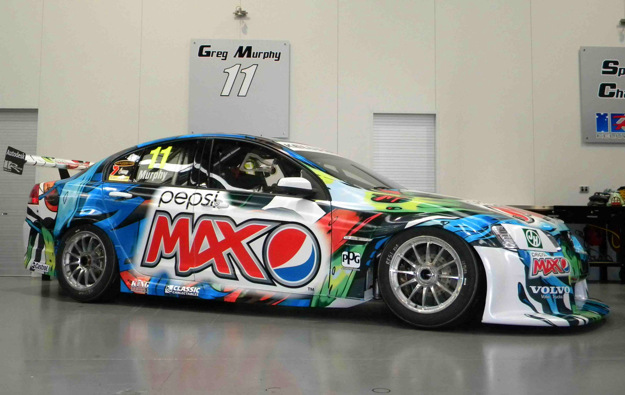
Photo / sourced
Personally, I’ve always felt that the lads and laddettes designing product behind the scenes for the V8 Supercars championship have punched well above their weight. The Australian championship pumps out some of the most incredible paint-schemes every year without fail, from designs packed with detail, to designs hinged on simplicity.
Whether Greg Murphy’s Commodores from 2011–’12 qualify as ‘incredible liveries’ is probably up to you …
Over the course of two seasons, the Kiwi touring-car great raced with more than 10 different paint schemes, and though they were all pretty bizarre, none could top the very first one they released — the ‘melted koosh ball’.
Honourary mention to the helmet-based technicolour wonder that the team handed Jacques Villeneuve in 2012, when the former Formula 1 champion stood in for Murphy while he underwent surgery.
Porsche 993 GT2 ‘Naked Lady’
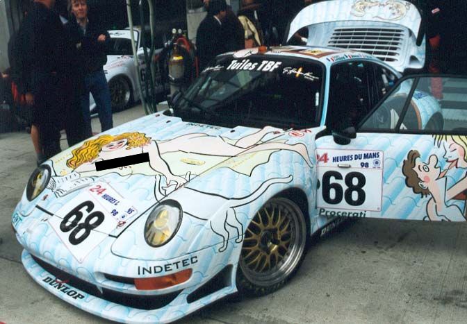
Photo / sourced
There are plenty of memorable and historic Porsche liveries out there. Martini this, Flying Lizard that, Gulf — how can we not mention them?
But, none of them ever featured a naked woman strewn across the bonnet sunbathing.
Elf Haberthur Racing campaigned this Porsche 911 GT2 at the 1998 24 Hours of Le Mans, where it finished 20th thanks to the efforts of its drivers; Hervé Poulain, Jean-Luc Maury-Laribiere, and Eric Graham.
Topping off a tiled background that’s meant to replicate the texture of a roof (a nod to the car’s primary sponsor; Tuiles TBF) are the car’s subjects. A couple engage in a cheeky French kiss on the left-hand side of the car, while on the right we find a woman reaching out to feed a bird. From a faux sunroof on top a lady peers outwards, while a cat sits curled up on what would normally be the 993’s parcel shelf.
This story unfortunately ends on a sad note, as the artist behind the illustrations, Georges Wolinski, was one of the cartoonists gunned down during last year’s Charlie Hebdo attacks. Rest in Peace.
BAR ‘zip’ livery
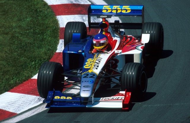
Photo / Formula 1
Politics and racing go together better than peanut butter and jelly, pork and apples, the Warriors and disappointment.
And politics were rarely very far away from the British American Racing (BAR) team. Leading into their promising opening season with drivers Jacques Villeneuve and Ricardo Zonta in 1999, the team had intended to run each driver with their own sponsor — Lucky Strike for the Canadian, 555 for the Brazillian.
However, the FIA didn’t really like this. Their rules stipulated that two-car teams must have identical-looking cars, sans for things like driver names and national flags.
So, BAR, adopting the level of logic and critical thinking you’d commonly associate with a primary-school student, found a solution. They simply smashed the two liveries together sidewards and applied a ‘zip’ down the middle.
I liked it, but literally everyone else hated it. And that was just the beginning of BAR’s problems.