


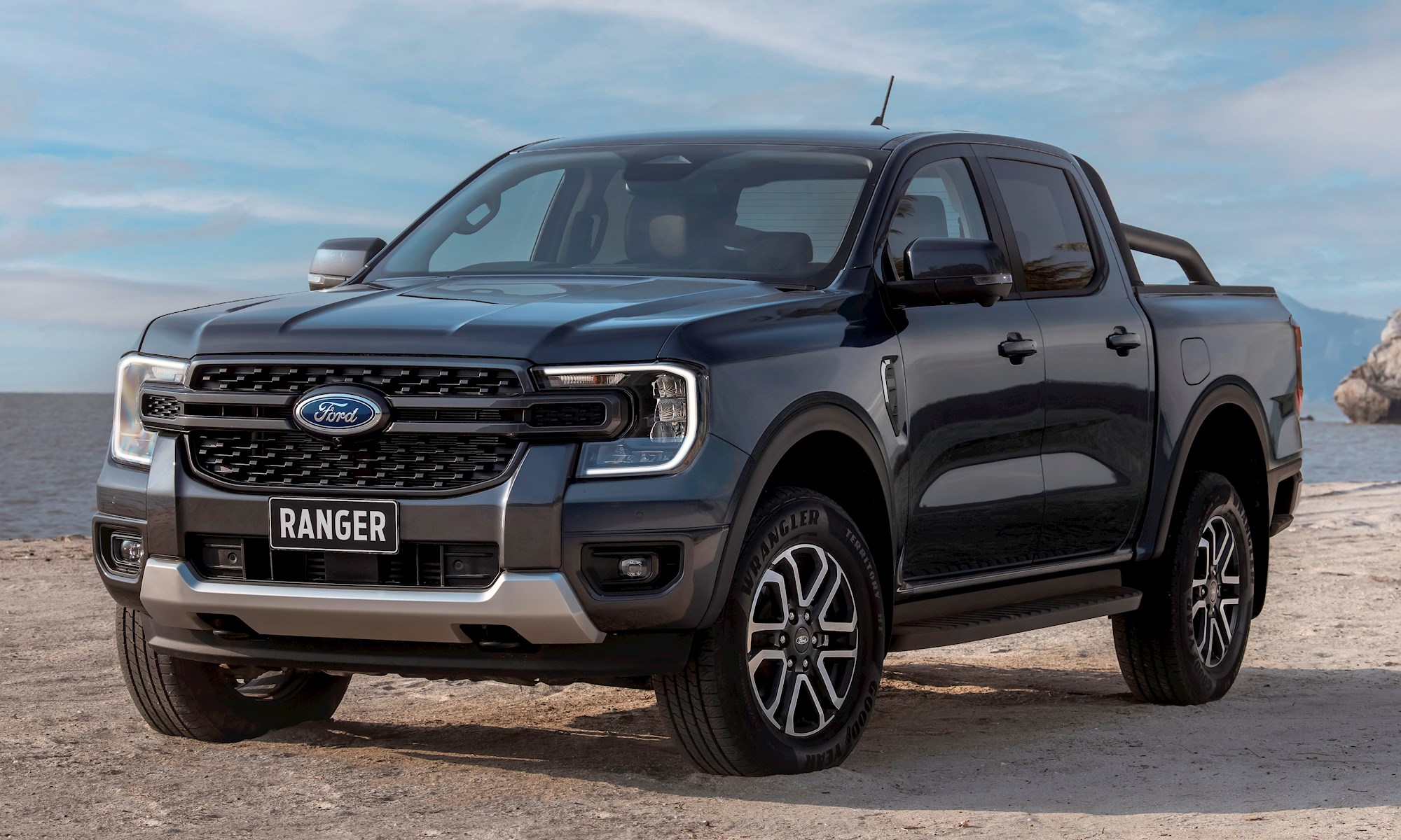
The fundamentals of the new Ford Ranger are clear: it’s a bigger, bolder truck that’s more in line with the Blue Oval’s global (especially American) light commercial offerings than ever before.
But Ford is also betting on customers finding delight in the detail. Here’s the inside story on five seemingly small design changes that the company hopes will help set the new Ranger apart from the one-tonne crowd.
The box step
Modern one-tonne utes are tall, especially when you’re trying to load over the wellside. The new Ranger features a “box step” behind the rear wheelarch that's big enough two feet. Two big feet according to the company.
READ MORE
- USED CAR GURU: Top tips for buying a Ranger T6 (2011-18)
- Ranger outsells every other ute combined in October sales
- Review: why Ranger Raptor still ravages its rivals
- FX4 Max, Wildtrak X: updated Ranger range tested
This idea was a big hit in customer clinics, says chief designer Max Tran: “When we were out observing consumers interacting with their trucks, we noticed one challenge right away.
To view all Ford Ranger models listed on DRIVEN, click here
When they were loading items into the beds, many had trouble reaching over the side of the truck; others were standing on the rear tyre or the bumper to gain access.
So we came up with the idea of a box step, placed strategically behind the rear tire. We mocked one up, and the response was overwhelming.
People literally told us that step would be reason enough to buy the Ford Ranger. That was a clear moment of ‘we’ve got something here’.”
Portrait screen
The move to a portrait-shape 12-inch touch screen was a given for Ranger, but there was debate on how it should be presented in the cabin.
“We were trying different positions, and one thing we tested was the screen floating,” says Tran. “Customers didn’t like that – they said it felt like an iPad just placed in vehicle. They said the floating screen looked flimsy and not ‘truck’ enough.
“We received overwhelming feedback - the customer did not want the display to look like it was tacked on,” says chief interior designer Andy Beard. “So, we integrated the display within a portrait screen, framed by the air vents, and supported by a flow-through console.”
The other big decision was whether to move the off-road controls away from the physical world and into the screen. Dynamic experiences supervisor (yes, that is his job title) Rob Hugo calls it a “big what if?” discussion.
“We believed that change – and it was a big one – would have several benefits. First, having everything in one screen would give drivers a more consistent way to control and monitor what mode they were in. Second, removing the various buttons would declutter the center console area.
“Like I said, this was a pretty big change, so took our idea to customer clinics in Europe, Thailand, Australia and South America to get their reaction.
“Some customers were like yes, that’s great, do it. Others were more hesitant, and said, hmmm, let me see how it works compared to the buttons I’m used to.
“So, we had that second group spend time with the new design and compare it with the current Ranger.
And when they could see it all the information in one place and didn’t have to reach or look for the right button, they were sold.”
The e-shifter
Ford’s initial intention was to equip Ranger with a rotary-type gear selector, as used in a number of its current products. But chief designer Max Tran says that idea was unanimously rejected in customer clinics.
“That led us to develop a new short-throw e-shifter. The beauty of this shifter is when people are driving, they don’t have to look down to see what gear they’re in – intuitively they can move it and find the gear a lot easier.
“Customers overwhelmingly liked the e-shifter – they liked the fact that it looked higher-tech, and many said it was a nice place to rest their hand while driving.”
Box cappings
There’s been a lot of smartening-up going on around the Ranger’s tray. The tailgate release handle is now fully integrated at the top, making for easier opening and closing – more like an SUV.
“Box capping” around the top of the tray is now standard across the range, which gives a nicer-looking finish and protects the paint, but is also functional: underneath are mounting points that allow easy fitting of accessories.
The tailgate workbench
Another simple idea derived from customer clinics: when lowered the tailgate often acts as a makeshift workbench for tradies, so Ford has made it official by adding mounts for a G-clamp, an imperial/metric ruler and two cupholders.
The new-design bedliner allows the fitment of cargo dividers, so owners can partition the tray the way they want. The tie-down point is load-bearing but also has a tongue design to hold the rubbish bag when the tailgate is used as a workbench.
“What’s really key here for the tie downs, the cappings and the pop-out box top mounting points is we’ve strengthened the sheet metal within the sides of the box,” says vehicle engineering manager Anthony Hall. “It’s now multiple layers of metal welded together with accessible mounting holes.
“And the formal mounting points will have load-carrying capacity – just like load-bearing walls in an apartment or home. So, our customers can carry more load than before along these top rails."
"These changes are ones we made as a direct result of our customers’ usage and feedback. And when we showed them these side tiedowns and load-bearing mounting points, they got excited and said, 'you’ve got to do this'."